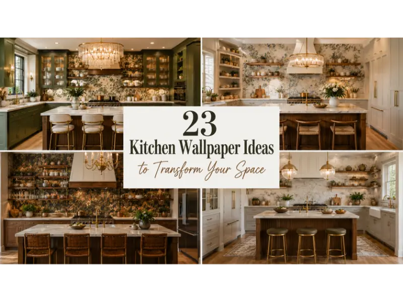
23 Kitchen Wallpaper Ideas to Transform Your Space
A kitchen can be practical without feeling plain. The right wall treatment can bring warmth, personality, color, and visual depth into a room that often contains hard surfaces and functional appliances. Kitchen Wallpaper Ideas have become especially appealing because wallpaper can create a major design change without the disruption of a full renovation. Current kitchen design is also moving toward richer color, tactile materials, personality, and warmer interiors rather than overly sterile spaces.
Before choosing a pattern, think beyond appearance. Consider your cabinet color, countertop material, natural light, wall location, cleaning needs, and the amount of visual activity already present. For areas exposed to moisture and splashes, washable or vinyl options are generally more practical, while wallpaper directly beside a sink or cooking surface needs extra protection.
Stylish Kitchen Wallpaper Ideas for Every Decorating Style
1. Botanical Green Kitchen Wallpaper
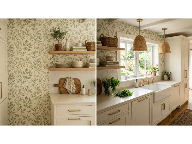
Kitchen Wallpaper Ideas with botanical patterns can instantly make a kitchen feel fresher and more connected to nature. A soft green print works especially well with white, cream, natural wood, or warm beige cabinetry. Choose a smaller botanical repeat when the kitchen has limited wall space, or use larger leaves when you want one wall to become the main visual feature.
The beauty of this look comes from its ability to bridge traditional and modern decorating. Add wooden cutting boards, ceramic dishes, woven baskets, and a few living herbs to reinforce the natural theme without making the room feel overly decorated. Keep surrounding surfaces relatively simple so the foliage remains the star.
Pro Tip: Match one subtle green tone from the wallpaper with your accessories instead of introducing several competing shades.
2. Soft Blue Floral Wallpaper
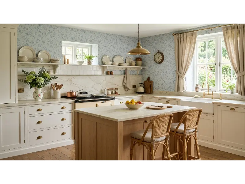
Soft blue floral wallpaper gives a kitchen a gentle, timeless character without overwhelming the room. It works beautifully with white cabinets and light wood because the pattern adds personality while keeping the overall palette airy. A delicate floral print can also make a compact kitchen feel more welcoming and visually layered.
For a more collected look, repeat the blue through small accessories such as ceramic bowls, tea towels, artwork, or a vintage style runner. Avoid matching every accessory exactly. The goal is coordination rather than perfect repetition, which creates a more natural room with the relaxed charm currently returning to kitchen interiors.
Pro Tip: Choose blue wallpaper with a warm undertone if your cabinets or flooring contain honey or golden wood tones.
Read More: 23 Bathroom Storage Solution Ideas to Maximize Space
3. Classic Toile Kitchen Wallpaper
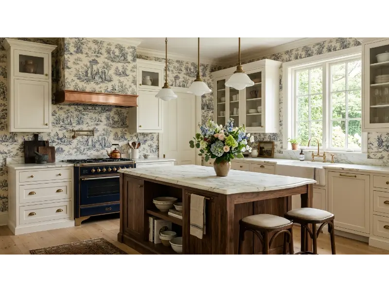
Classic toile creates an instant sense of history and refinement. Its detailed illustrations can turn an ordinary wall into a decorative backdrop while pairing naturally with traditional cabinetry, farmhouse sinks, antique brass hardware, and natural wood. Choose navy and cream for a crisp appearance or muted olive and beige for something softer.
Because toile already contains a story, you do not need many decorative objects around it. A few vintage inspired accessories, open shelves, and simple ceramics can support the theme without competing with the print. This approach works particularly well around breakfast areas where the wallpaper can visually define a smaller zone.
Pro Tip: Use toile on a dining or breakfast wall rather than directly behind a stove to protect the detailed pattern from heavy cooking splashes.
4. Warm Terracotta Geometric Wallpaper
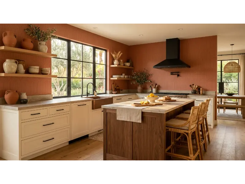
Terracotta wallpaper can bring warmth into kitchens dominated by white, gray, or cool finishes. A restrained geometric pattern adds structure without relying on bold decoration, making it a smart option for contemporary spaces that need more personality. Pair it with cream cabinetry and natural wood for an earthy, comfortable atmosphere.
This color also works beautifully with Mediterranean and modern organic interiors. Introduce handmade ceramics, linen textiles, wood accessories, and subtle black accents to create contrast. Keep the remaining colors grounded so the terracotta feels intentional rather than visually heavy.
Pro Tip: If your kitchen receives limited natural light, select a lighter terracotta background instead of a deep rust shade.
5. Small Scallop Pattern Wallpaper
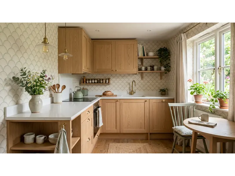
A small scallop pattern can introduce movement without making a compact kitchen feel crowded. The repeating curved shape softens the straight lines of cabinets and counters, creating a subtle decorative layer. Choose neutral or pastel colors when your kitchen already has several materials competing for attention.
This design works particularly well above a breakfast nook, behind open shelving, or on a wall opposite the main cooking area. The pattern adds interest from a distance while remaining understated up close. It is also a useful choice when you want personality without committing to a dramatic mural or oversized botanical print.
Pro Tip: Use curved accessories such as rounded pendant lights or arched mirrors to echo the wallpaper’s shape.
Read More: 23 Home Decor Ideas to Instantly Transform Your Space
6. Moody Navy Wallpaper
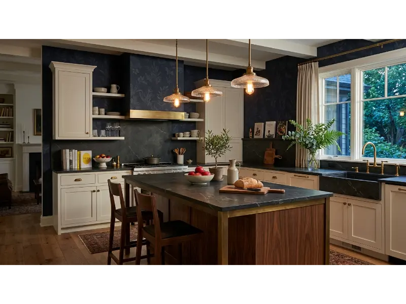
Dark wallpaper can make a kitchen feel intimate, sophisticated, and surprisingly luxurious. Navy works particularly well when paired with warm white cabinets, brass fixtures, walnut, and creamy stone. A tonal pattern prevents the wall from looking flat while maintaining the dramatic mood.
Use this approach on one accent wall if your kitchen is small or has limited daylight. In a larger kitchen, the darker backdrop can create a sophisticated dining zone or visually frame open shelving. Balance the deep color with lighter countertops and reflective fixtures so the room still feels comfortable rather than closed in.
Pro Tip: Test the wallpaper at different times of day because dark colors can change dramatically under natural and artificial lighting.
7. Vintage Fruit Wallpaper
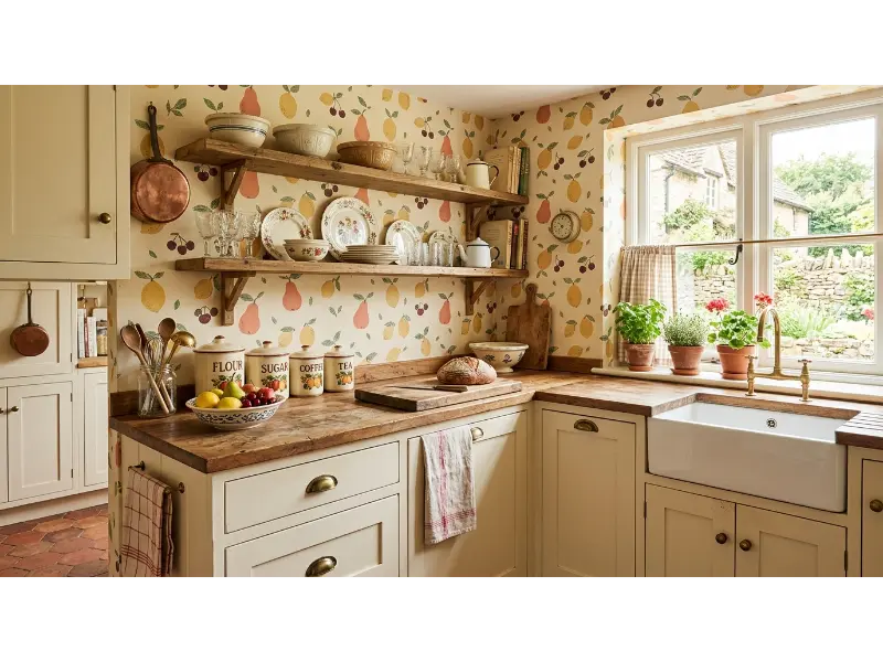
Fruit motifs bring playful personality to kitchens and work especially well with cottage, vintage, and European farmhouse styles. Instead of choosing an overly bright novelty pattern, look for hand drawn illustrations in muted greens, yellows, creams, and earthy reds. These tones feel decorative while remaining sophisticated enough for everyday living.
A fruit print becomes even more convincing when paired with natural materials. Think wooden shelves, ceramic pitchers, linen towels, woven baskets, and simple copper or brass details. You can also use the wallpaper inside a small pantry or breakfast nook if covering an entire kitchen feels too bold.
Pro Tip: Repeat only one or two colors from the fruit illustrations elsewhere in the room for a polished finish.
8. Minimalist Line Art Wallpaper
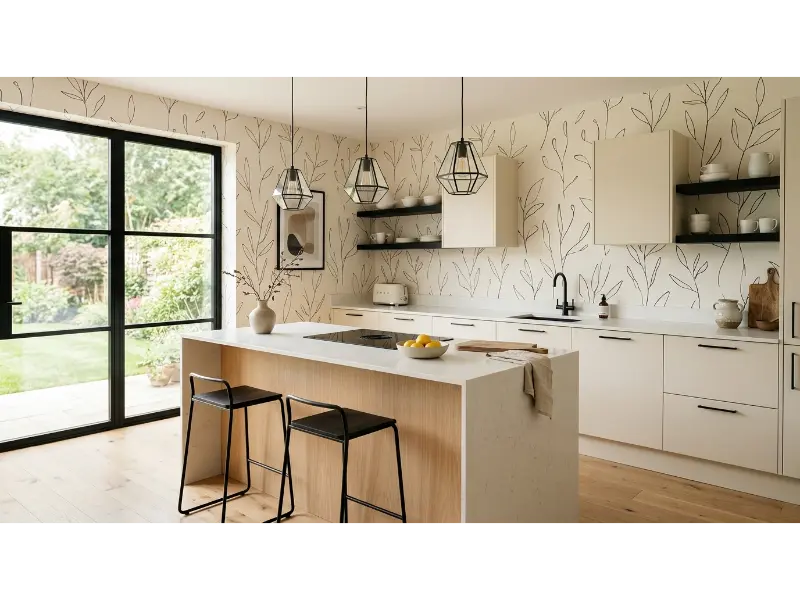
Minimalist line art offers a creative alternative to traditional floral wallpaper. Fine black or charcoal illustrations against an ivory background can add visual interest while preserving the clean appearance of a modern kitchen. This style suits homeowners who want something distinctive but do not enjoy highly decorative patterns.
Pair the wallpaper with simple cabinetry, natural wood, and a limited accessory collection. The open space around the drawings gives the kitchen room to breathe. It can also work beautifully in a small coffee station or breakfast corner where the delicate pattern adds character without taking over the room.
Pro Tip: Choose a wallpaper with generous negative space if your kitchen already has open shelving or heavily styled countertops.
9. Soft Grasscloth Inspired Texture
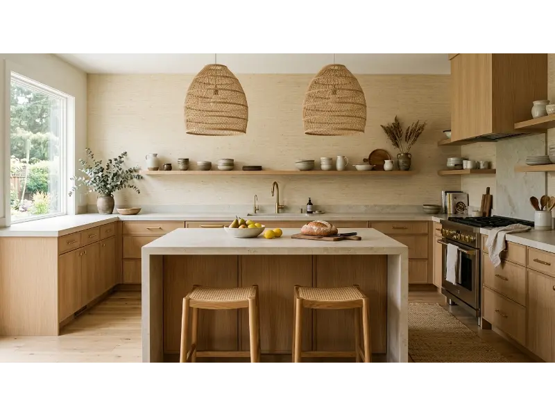
Texture can sometimes transform a kitchen more effectively than a busy pattern. Grasscloth inspired wallpaper introduces subtle depth and warmth while maintaining a sophisticated neutral palette. Its woven appearance works particularly well with wood, stone, linen, rattan, and other natural finishes.
Because textured wallcoverings can have specific maintenance needs, use them away from direct splashes and intense cooking zones. They are excellent behind dining tables, beside pantry areas, or on a large open wall. The result feels layered without relying on strong color.
Pro Tip: If you love the texture but need easy cleaning, look for a kitchen suitable wallcovering with a protective or washable surface rather than delicate natural fibers.
10. Black and White Botanical Wallpaper
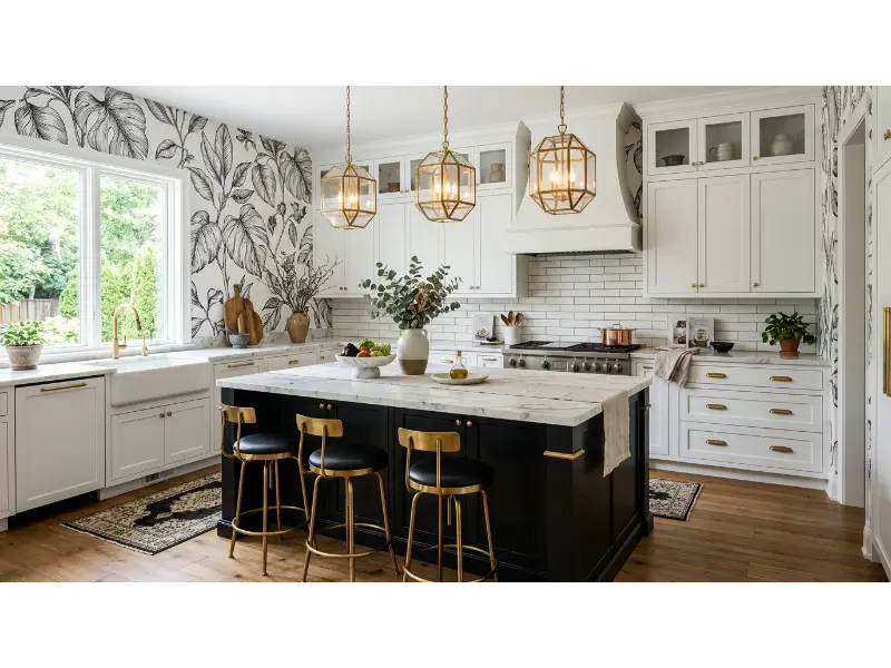
Black and white botanical wallpaper delivers strong contrast without introducing multiple colors. This makes it especially useful when your kitchen already contains distinctive countertops, flooring, or cabinetry. The monochrome palette creates a cohesive backdrop while the botanical shapes prevent the room from feeling too severe.
For balance, combine the dramatic wallpaper with warm materials such as oak, brass, leather, or natural stone. If you use black cabinetry as well, keep the countertops and some surrounding surfaces light. This creates visual breathing room and helps the botanical design remain readable.
Pro Tip: Large botanical prints usually look more intentional on a spacious uninterrupted wall than on several small fragmented sections.
11. Lemon Inspired Wallpaper
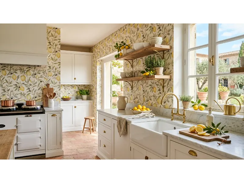
Citrus wallpaper can make a kitchen feel sunny and energetic without requiring a complete color makeover. Lemon branches look particularly beautiful with cream, white, olive, and natural wood. Choose a refined botanical illustration instead of a cartoon style print when you want a more grown up and timeless appearance.
This pattern suits breakfast spaces, pantry walls, and kitchens with strong natural light. Add real lemons in a simple bowl, a few green herbs, and warm wood accessories to connect the pattern with the rest of the room. The result feels cheerful while still looking carefully designed.
Pro Tip: Keep countertops visually quiet when using citrus wallpaper because the detailed print already provides plenty of decoration.
12. Soft Neutral Arch Wallpaper
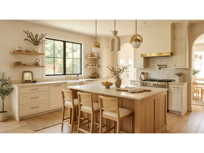
Arched patterns can soften a kitchen filled with rectangular cabinets and straight countertops. A neutral arch print gives the wall gentle rhythm while remaining easy to coordinate with existing finishes. Beige, ivory, taupe, or soft clay tones work especially well when you want a warm modern atmosphere.
This design can also help connect architectural details throughout the room. If your kitchen has an arched doorway, rounded pendant, or curved island stools, the wallpaper can subtly echo those shapes. The repetition creates a more intentional design without requiring every element to match.
Pro Tip: Select an arch scale that relates to your room. Tiny arches suit small spaces, while larger arches work better on broad walls.
13. Scandinavian Blue and White Wallpaper
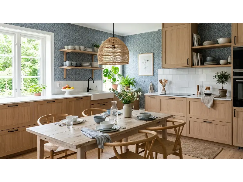
Blue and white wallpaper is a dependable choice for a bright Scandinavian inspired kitchen. Geometric leaves, delicate florals, or simple folk motifs can create personality while maintaining a clean visual palette. The combination feels fresh and works beautifully with pale wood and white surfaces.
To avoid a room that feels too cold, introduce warm oak, woven textures, soft lighting, and handmade ceramics. A few imperfect natural pieces can keep the space from looking overly coordinated. This style is especially effective when you want an organized kitchen that still feels welcoming.
Pro Tip: Add warm wood or natural fibers whenever your blue wallpaper starts making the room feel visually cool.
14. Dramatic Marble Effect Wallpaper
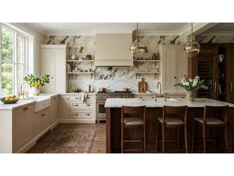
Marble effect wallpaper can create a luxurious impression without covering the entire kitchen in real stone. A restrained design with soft veining works better than an overly busy print because it provides movement while maintaining a refined appearance. Pair it with simple cabinetry and carefully chosen metal accents.
Use this concept as a statement wall rather than covering every available surface. The wallpaper can frame a dining area, coffee station, or tall pantry wall. Because the pattern already suggests a premium material, simple styling will often look more expensive than excessive decoration.
Pro Tip: Coordinate the wallpaper’s dominant vein color with your hardware or countertop undertones for a seamless connection.
15. Retro Checkerboard Wallpaper
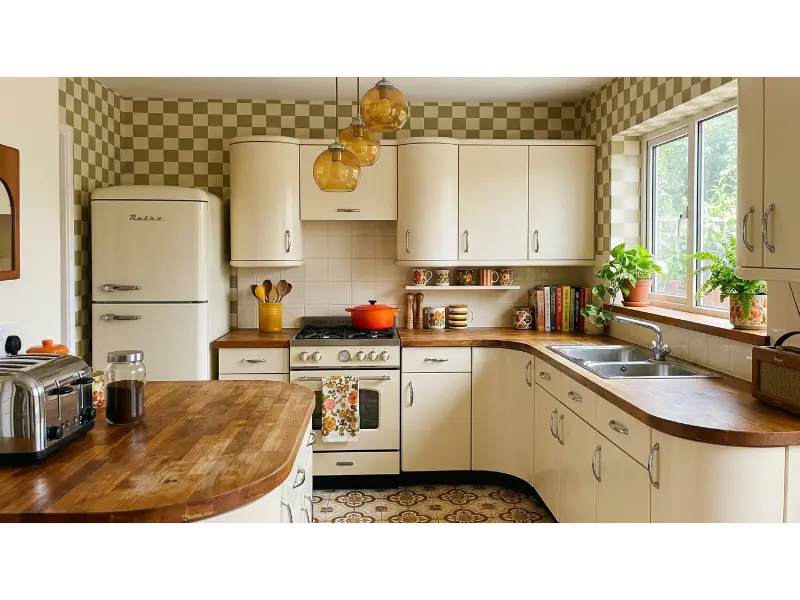
Checkerboard wallpaper brings a playful graphic quality to kitchens and connects beautifully with the renewed interest in retro interiors. Designers are increasingly using nostalgic color combinations, curved forms, and vintage inspired details to make kitchens feel more personal and lively.
For a sophisticated result, avoid extremely bright primary colors unless the rest of your kitchen supports them. Muted olive, cream, dusty blue, terracotta, or soft brown can make the checkerboard feel modern. Pair it with simple vintage accessories rather than turning the entire kitchen into a themed room.
Pro Tip: Use checkerboard wallpaper on one wall or breakfast nook when the kitchen already has patterned flooring.
16. Delicate Meadow Wallpaper
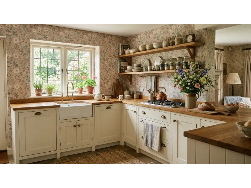
A meadow inspired print creates a relaxed, garden like feeling that works naturally in cottage kitchens. Look for small flowers and loosely arranged stems instead of dense, oversized blooms. Soft sage, dusty blue, cream, and blush create an easy palette that complements warm wood and painted cabinetry.
This style can make a plain kitchen wall feel more personal without demanding major changes elsewhere. It works especially well around windows, breakfast areas, and open shelves. Keep accessories simple and let the wallpaper provide most of the decorative detail.
Pro Tip: If the floral pattern contains several colors, choose one quiet background color for nearby textiles to maintain visual balance.
17. Olive Green Geometric Wallpaper
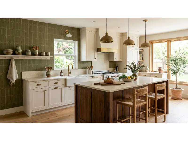
Olive green creates a grounded, sophisticated backdrop while geometric patterns add contemporary structure. This combination works especially well with warm whites, walnut, oak, cream stone, and aged brass. It is a strong option when you want color but prefer something more muted than emerald or bright green.
Use the wallpaper to create a visual transition between cooking and dining zones in an open plan kitchen. A patterned wall can establish a separate feeling without adding a physical partition. This technique is especially useful when the kitchen shares space with a living or dining area.
Pro Tip: Repeat olive green in only a few accessories so the wall feels connected to the room rather than color matched.
18. Tiny Vintage Stripe Wallpaper
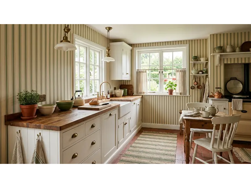
Vertical stripes can subtly influence how a kitchen feels by drawing the eye upward. Narrow stripes in cream, beige, sage, or dusty blue create a classic backdrop that does not compete with cabinets, shelves, or artwork. They are especially useful when you want a timeless pattern rather than a seasonal trend.
A striped wall can also support vintage and farmhouse interiors without becoming overly rustic. Pair it with simple ceramics, natural wood, aged brass, and linen. The result feels collected and comfortable rather than staged.
Pro Tip: Choose narrow stripes for a delicate look and wider stripes when you want the wallpaper to make a stronger architectural statement.
19. Oversized Tropical Leaf Wallpaper
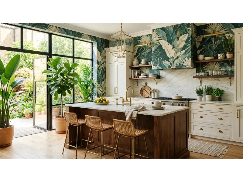
Oversized tropical leaves can create a dramatic focal point for homeowners who enjoy expressive interiors. The large scale makes the wall feel intentional and artistic, especially when the kitchen itself has simple cabinetry and restrained finishes. Deep green works particularly well with walnut, brass, cream, and natural stone.
Because large patterns carry significant visual weight, use them selectively. A single wall can provide enough drama without making the kitchen feel visually crowded. This approach also works well in open plan homes where one bold wall can anchor the kitchen zone.
Pro Tip: Keep the rest of the room relatively quiet and repeat only one or two colors from the leaves.
20. Warm Beige Textured Pattern
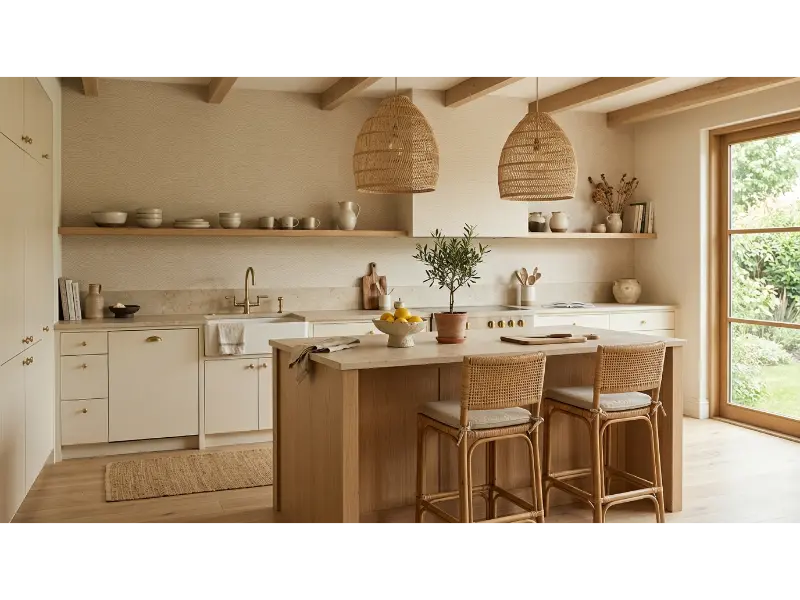
A warm beige pattern can be the perfect middle ground between plain paint and bold wallpaper. Subtle waves, organic shapes, or tonal botanical marks add depth without creating a strong focal point. This approach suits kitchens where the cabinetry, countertop, or flooring already provides plenty of visual interest.
Neutral wallpaper also gives you flexibility when decorating around changing accessories. You can introduce seasonal flowers, colorful ceramics, artwork, or textiles without worrying about clashes. The result feels calm, warm, and adaptable rather than tied to one decorating trend.
Pro Tip: Compare the wallpaper with your countertop under natural daylight because beige undertones can shift from pink to yellow depending on surrounding materials.
21. Cottage Rose Wallpaper
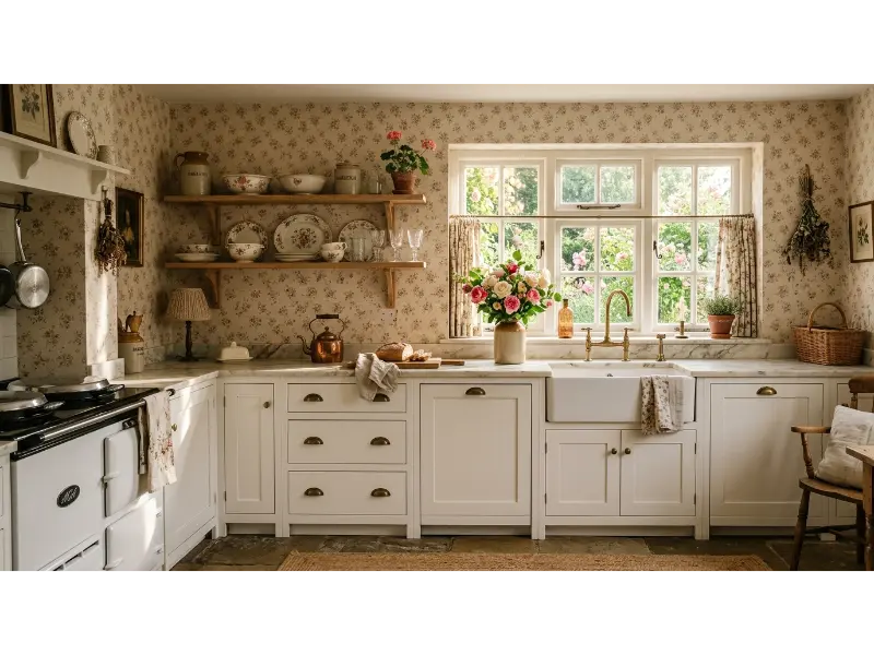
Small rose wallpaper can give a kitchen a romantic character while still feeling practical and timeless. Muted florals usually work better than highly saturated pinks because they pair naturally with cream cabinetry, oak, brass, and stone. This look suits homeowners who enjoy traditional details but want a softer, more personal space.
Use the print behind a breakfast table, pantry door wall, or open shelving area for a charming focal point. You can support the theme with vintage ceramics and fresh flowers, but avoid turning every surface into a floral display. A restrained approach keeps the room elegant.
Pro Tip: If the roses are detailed, choose simple cabinet hardware and plain textiles so the pattern remains the main decorative feature.
22. Contemporary Abstract Wallpaper
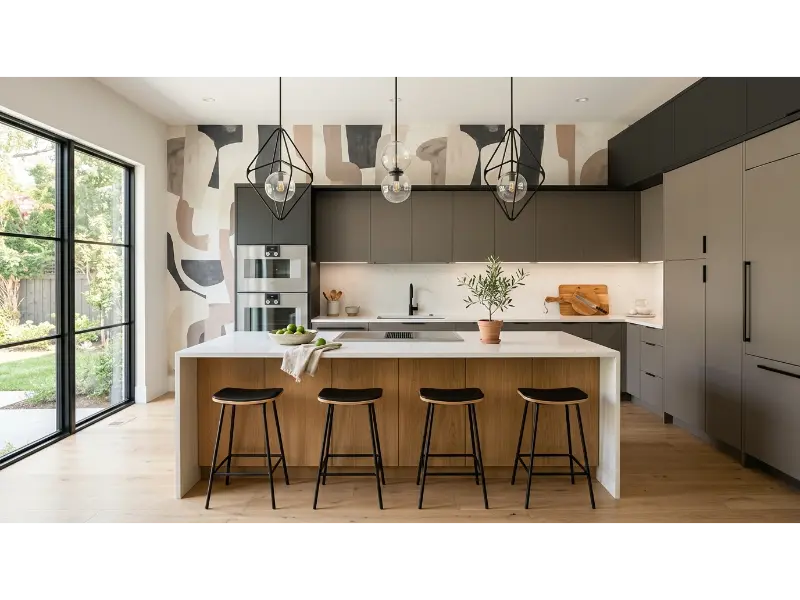
Abstract wallpaper gives a kitchen an artistic edge without relying on traditional floral or geometric motifs. Look for organic brushstrokes, flowing shapes, or subtle painterly forms in colors that already appear in the room. This can make a simple kitchen feel curated and individual.
The key is restraint. If the wallpaper contains several tones, keep cabinetry and major surfaces relatively simple. A sculptural light, handmade vase, or single piece of artwork can reinforce the creative mood without creating competition. This style works particularly well in contemporary and transitional homes.
Pro Tip: Pull two colors from the abstract design for accessories, then leave the remaining colors out of the room.
23. Warm Botanical Neutral Wallpaper
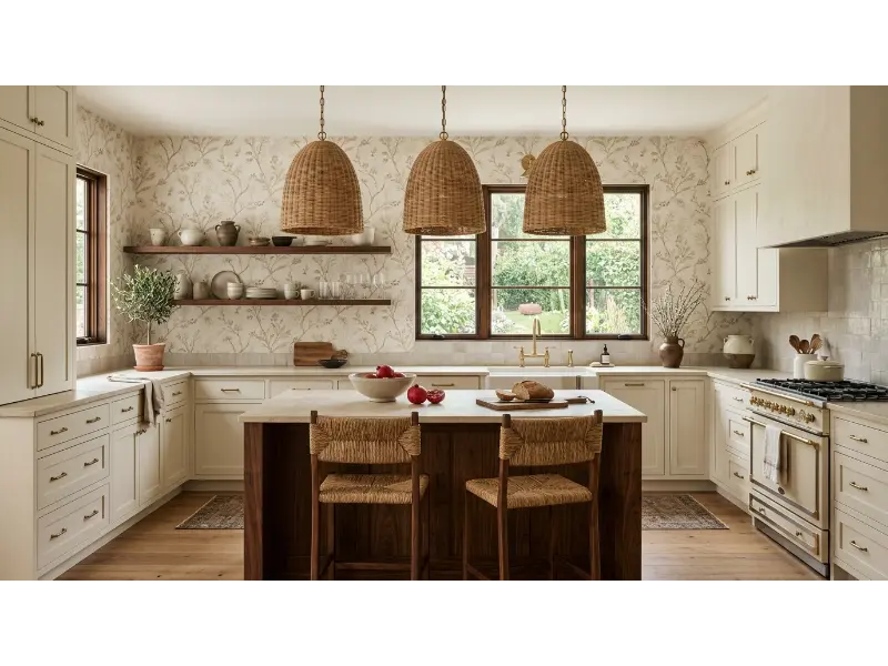
Among Kitchen Wallpaper Ideas, warm neutral botanicals offer one of the easiest ways to combine personality with long term versatility. A beige, cream, taupe, and soft brown pattern can complement many cabinet styles while adding enough detail to make the room feel finished. It is especially effective when you want warmth without strong color.
This approach also works beautifully with the current movement toward layered, comfortable interiors that mix natural textures, old and new elements, and personal details. Add wood, woven materials, ceramic pieces, and warm lighting to build depth while keeping the palette cohesive. The result feels lived in rather than overly styled.
Pro Tip: Order a sample before installation and place it beside your cabinets, counter, and floor because neutral colors can look very different under your kitchen lighting.
How to Choose the Right Wallpaper for Your Kitchen
The best kitchen wall decor begins with the location. Wallpaper can work beautifully on a feature wall, around a breakfast area, beside a pantry, or in an open plan dining zone. Areas exposed to frequent steam, grease, and splashes require more care. Experts recommend washable or vinyl wallcoverings for humid kitchen environments, while wallpaper directly beside a sink or stove may need additional protection or a different surface altogether.
Think about scale before ordering a full roll. Large botanical designs can look sophisticated on broad walls but may become visually fragmented around windows, cabinets, and doors. Small repeats work well in compact spaces because they create texture without dominating the architecture. Always order samples when possible and examine them during both daylight and evening lighting.
Your cabinets should guide the wallpaper color rather than the other way around. White cabinets can support almost any palette, while wood cabinets often look best with warm neutrals, greens, blues, or earthy patterns. If your countertop contains strong veining, consider a calmer print. If the kitchen feels plain, a stronger pattern can provide the missing focal point.
Durability matters just as much as appearance. Washable and scrubbable wallpapers are particularly useful where occasional splashes occur, while delicate hand painted or embroidered papers may be better reserved for lower risk areas. If you want wallpaper near a backsplash, consider a protective transparent panel or place the paper above a durable backsplash instead of directly behind the sink or cooktop.
Frequently Asked Questions
Is wallpaper a good idea for a kitchen?
Yes, wallpaper can be an excellent kitchen decorating choice when you select an appropriate product and location. Modern washable and vinyl options can handle more everyday wear than delicate traditional papers. However, wallpaper should not automatically replace a durable backsplash in areas exposed to direct heat, grease, and frequent water splashes.
What type of wallpaper is best for a kitchen?
Washable, scrubbable, and vinyl coated wallpapers are among the more practical options for kitchen walls because they offer better resistance to moisture and everyday cleaning. Solid vinyl can provide additional durability. Always check the manufacturer’s specific instructions because products vary in their cleaning and moisture resistance.
Can wallpaper be used as a kitchen backsplash?
It can be used in some backsplash situations, but material and placement matter. Vinyl based options are more appropriate than delicate paper or fabric products. For areas directly exposed to water, grease, or cooking heat, a protective panel or durable backsplash can provide a safer solution.
Does wallpaper make a small kitchen look smaller?
Not necessarily. The right pattern can actually make a small kitchen feel more finished and visually interesting. Light backgrounds, delicate patterns, vertical designs, and wallpapers with generous negative space can prevent the room from feeling crowded. Avoid using several competing patterns in a small space.
Should kitchen wallpaper match the cabinets?
It does not need to match exactly. Instead, look for colors that complement the cabinet undertones. For example, warm wood can pair beautifully with olive, cream, terracotta, beige, or muted blue. Exact matching can make the design feel overly coordinated, while related tones create a more natural result.
Is peel and stick wallpaper suitable for kitchens?
Peel and stick wallpaper can work for temporary decorative applications, especially in lower risk areas, but quality and installation conditions vary widely. Before using it near moisture, confirm that the specific product is rated for that environment. Avoid treating a decorative peel and stick product as a substitute for a heat resistant backsplash.
Where should wallpaper go in an open plan kitchen?
A dining wall, breakfast nook, pantry wall, or area beside a breakfast bar can be particularly effective. Wallpaper can visually define a zone without adding a physical divider. This approach can make an open plan layout feel more intentional and layered.
How do I stop kitchen wallpaper from looking too busy?
Choose one dominant pattern and keep nearby surfaces relatively calm. If the wallpaper is colorful, use quieter accessories. If the pattern is large, consider simpler cabinetry and countertops. A useful design principle is to let one major surface carry the strongest visual pattern while supporting it with quieter materials.
What wallpaper color makes a kitchen feel warmer?
Cream, beige, terracotta, warm taupe, muted olive, dusty rose, and soft brown can all add warmth. The best choice depends on your existing finishes. Warm wood and brass usually pair especially well with earthy neutrals and softened botanical colors.
Should I wallpaper the whole kitchen?
You can, but you do not have to. A single feature wall often creates enough impact while requiring less material and reducing visual competition. Wallpapering a breakfast area, dining wall, pantry zone, or open wall can provide the transformation without covering every surface.
Final Thoughts
The best Kitchen Wallpaper Ideas do more than decorate an empty wall. They help establish the mood of the entire room, connect colors and materials, define functional zones, and give a practical space a stronger sense of personality. From delicate botanicals and classic toile to dramatic tropical leaves and understated textured neutrals, there is a wallpaper style for almost every kitchen.
The smartest choice balances beauty with real life. Consider where the paper will go, how much moisture and cleaning it will face, how the pattern interacts with cabinets and counters, and whether the scale suits the room. With the right material, thoughtful placement, and a pattern that genuinely reflects your style, wallpaper can make your kitchen feel more finished, welcoming, and distinctly yours.